No edit summary |
(→NOTICE) |
||
| (47 intermediate revisions by 10 users not shown) | |||
| Line 1: | Line 1: | ||
| + | __TOC__ |
||
| ⚫ | |||
| + | == Redesign Oct-Nov 2009 == |
||
| + | See the discussion on the forum [[Forum:Skins & home page design Oct 2009|here]]. |
||
| + | == Illustrative Images == |
||
| ⚫ | |||
| + | I would like to begin adding illustrative images and use stylized screen shots for the most part to give a consistent feel while giving the broadest amount of source material. For example on the [[Niffis|creature]] pages, this would go at the top right. A new section for artwork would be added where we could thumbnail any artwork available. I've given examples of three stylizations that seem to work well and I would like input on what people think looks best. --[[User:Tlosk|Tlosk]] 08:21, 9 December 2008 (CST) |
||
| + | <Replaced Images with SS due to naming issues, click to see full size.><br> |
||
| ⚫ | |||
| + | [[File:Illustrative Images.jpg|150px]] |
||
| + | :I would say style 1 or 3. I like the full color and the gold type that mimics the splash screen style. I would like 1 better if the filter wasn't applied so heavily. Is that poster edges in photoshop? I would put edge thickness and intensity at 0, and posterization at 4-6. I think too much of the detail gets taken over by the black of the edges. In addition to adding an artwork section to the creature pages, I'd suggest adding all the creature art to the [[Artwork]] page. --[[User:An Adventurer|An Adventurer]] 10:44, 9 December 2008 (CST) |
||
| ⚫ | |||
| + | :: I also vote for style #1. It will be a great touch to those pages. --[[User:Atarax|Atarax]] 15:46, 14 December 2008 (CST) |
||
| + | ::: Let me give my rationale for a less detailed image, since these are intended to be illustrative images the stylization was intended to move from a particular creature/place/item to a generalization as well as to provide some similarity across images by lessening lighting/resolution issues. In other words a consistent feel for illustrative images. The effect is done using the free open source program [http://www.gimp.org/ GIMP 2.6] using Filters>Artistic>Cartoon (Mask Radius 8.00; Percent Black 0.200) on 200x200 pixel image. Best to use a PRT SCR from in game, or save as bitmap if cropping with [[Wiki Swiss Tool]] because jpg artifacts sometimes get highlighted by the filter. |
||
| + | ::: I should add that style 2 might work well for some things, I've temporarily used it for [[Moarsman]] so you can see how it fits into an actual page. Style 2 uses a downloadble filter [http://registry.gimp.org/node/5921 Quick Sketch] which is placed into the C:\Program Files\GIMP-2.0\share\gimp\2.0\scripts folder (or in the scripts folder in your User profile folder) and Script-Fu>Artistic>Quicksketch (Blur Factor 30). The contrast may need to be adjusted for a more pleasing image (Colors>Brightness-Contrast).--[[User:Tlosk|Tlosk]] 10:32, 18 December 2008 (CST) |
||
| ⚫ | |||
| ⚫ | |||
| ⚫ | |||
| + | == Redesign October 2008 == |
||
| ⚫ | |||
| + | I propose to add a link to the ''navigation'' that goes to the [[Current Patch]]. -- [[User:Atarax|Atarax]] |
||
| ⚫ | |||
| + | :took a little fiddling around with and searching mediawiki for info, but I've added a topics side bar --[[User:An Adventurer|An Adventurer]] 13:40, 28 October 2008 (CDT) |
||
| ⚫ | |||
| ⚫ | |||
| + | ::Very cool. That makes it very convenient to get around. The only other suggestion I have is to possibly put a link to the [[Page Templates]] in the ''toolbox'' or ''navigation'' section. It would make contributing easier, especially for newcomers. -- [[User:Atarax|Atarax]] |
||
| ⚫ | |||
| + | :::I'm not sure how to edit the toolbox. I created a help section on the main nav section. Please let me know if this makes the nav bar too long. --[[User:An Adventurer|An Adventurer]] 14:59, 2 November 2008 (CST) |
||
| ⚫ | |||
| + | :::: I like the help section there. I think you should put the ''search'' at the top, followed by ''navigation, topics, help, toolbox'' (in that order). Other than that, its definitely not too long. --[[User:Atarax|Atarax]] |
||
| − | Here's a link I found that goes into some detail on the setting: |
||
| − | [http://www.mediawiki.org/wiki/Manual:FAQ#How_do_I_change_the_logo.3F How to change logo]. I'll mock up some more logos (that was just a quick one that was cut from the page banner title) and post them in the next day or two. --[[User:Tlosk|Tlosk]] 21:09, 3 March 2008 (CST) |
||
---- |
---- |
||
| + | I read your post you removed Tlosk. I was thinking about leaving the main topics section below the welcome, and keeping the larger links at the top. But most of those links at the top of the home page are either in the topics section, or now a link on the side bar. Maybe I will play around with it in the sandbox later --[[User:An Adventurer|An Adventurer]] 16:22, 28 October 2008 (CDT) |
||
| ⚫ | |||
| + | I recolored the topics section, it's in the [[Sandbox]]. let me know what you think. --[[User:An Adventurer|An Adventurer]] 15:18, 30 October 2008 (CDT) |
||
| + | |||
| + | :Cool, I think that looks nicer. (I shifted the few posts at the bottom back to a last is first format so easier to see new ones for the talk page). --[[User:Tlosk|Tlosk]] 17:39, 30 October 2008 (CDT) |
||
| + | |||
| + | :I think it looks a lot nicer too. The links are a little hard to read though (grey on black). Overall a nice improvement! --[[User:Atarax|Atarax]] 30 October 2008 (CDT) |
||
| + | |||
| + | ::I changed the color of the links to a lighter grey. I blocked the user that removed all the content from this page. Do we need to protect it? --[[User:An Adventurer|An Adventurer]] 19:00, 30 October 2008 (CDT) |
||
| + | |||
| + | :::I don't think so, if I had to guess I think it was probably accidental, being a new user. --[[User:Tlosk|Tlosk]] 20:39, 30 October 2008 (CDT) |
||
| + | |||
| + | :I find the white links in the big black box on large white page very hard to read. I think there's just too much contrast between the black background and the rest of the page. --[[User:Widgeon|Widgeon]] 01:19, 31 October 2008 (CDT) |
||
| + | |||
| + | ::There are now 5 versions of the banner+topics in the [[Sandbox]], please have a look --[[User:An Adventurer|An Adventurer]] 10:35, 31 October 2008 (CDT) |
||
| + | |||
| + | :::I find 1, 2, and 5 all appealing, no strong preference here. --[[User:Tlosk|Tlosk]] 14:58, 1 November 2008 (CDT) |
||
| + | |||
| + | :::I think the first one is the easiest to look at. 2, 3 and 4 all have the black background in a white page that I find hard to read. 5 isn't too bad, but I'd still go with a lighter color with the border. Please keep in mind that this is more an issue of usability (hard to read) than taste (looks good or bad). --[[User:Widgeon|Widgeon]] 08:13, 2 November 2008 (CST) |
||
| + | |||
| + | == Suggestion for turbine articles == |
||
| + | |||
| + | For patch pages, I think it would be a cool idea to give the ''teaser'', ''roll-out article'', and ''release notes'' a background color or some other styleing make them seem more like they are from the Turbine website, i.e. official (kind of like we do with dev posts). Would kind of help separate them from the rest of the patch page. Any thoughts on this? --[[User:Atarax|Atarax]] 28 October 2008 (CDT) |
||
| + | |||
| + | :I've added an [[Archive of Internet Article Template]] for the current site design. So, if others think its a good idea to start using the internet article templates for patch notes, we have the two most recent templates available. We could also just use the light grey dev post template, so all patch pages use the same style. --[[User:An Adventurer|An Adventurer]] 12:47, 31 October 2008 (CDT) |
||
| + | |||
| + | == Site Logos and Appearance == |
||
| + | I still see the old "Set $wgLogo..." thing, any idea why that is? --[[User:Sanguis|Sanguis]] 21:42, 15 May 2008 (CDT) |
||
| + | |||
| + | :It's a cache issue, Sometimes it will clear if you just hit refresh also but more likely you'll need to clear your browser's cache and then you should see it. In Firefox go to Tools->Options->Privacy->Settings, make sure cache is checked, hit OK, then hit Clear Now. In IE I believe it's Tools->General->Delete Browsing History. Not sure on IE though (also menu bar may be hidden, if so I think there's a tools button). Let me know if you see it after that, if not there's something I might do to the site.--[[User:Tlosk|Tlosk]] 06:06, 16 May 2008 (CDT) |
||
| + | ::It's all good now, I cleared my cache right after that and its been fine since. Looks good, good job. --[[User:Sanguis|Sanguis]] 00:30, 18 May 2008 (CDT) |
||
| ⚫ | |||
| ⚫ | |||
---- |
---- |
||
| ⚫ | |||
| ⚫ | |||
| ⚫ | |||
| + | |||
| ⚫ | |||
| + | |||
| ⚫ | |||
| + | |||
| ⚫ | |||
| + | |||
| ⚫ | |||
| + | |||
| ⚫ | |||
| + | |||
| ⚫ | |||
| + | |||
| + | Also, I think we should consider replacing that image in the top left corner, the SET $wgLogo to the URL path, it looks ugly and it would not be hard to make a nice ACC one. Do we need Gouru to do that? If not then if someone knows how, I would be happy to make the logo for it. --[[User:Sanguis|Sanguis]] 14:44, 29 January 2008 (CST) |
||
| + | |||
| ⚫ | |||
| ⚫ | |||
| ⚫ | |||
| + | |||
| ⚫ | ::After reading the comments about the Home image, I noticed that too, I made a quick image with what I believe are the proper dimensions and properly alpha'd background but I couldn't find a contact to send to, does anyone have contact info for Gouru? Here's the image if anyone has suggestions on improving it: --[[User:Tlosk|Tlosk]] 15:28, 22 February 2008 (CST) |
||
| ⚫ | |||
| + | |||
| ⚫ | |||
| ⚫ | |||
| ⚫ | |||
| ⚫ | |||
| + | |||
| ⚫ | |||
| + | |||
| ⚫ | |||
| − | --[[User:Gouru|Gouru]] 17:22, 3 March 2008 (CST) |
||
---- |
---- |
||
| ⚫ | |||
| ⚫ | |||
| ⚫ | |||
| ⚫ | |||
| ⚫ | :That's a website for a guild on Frostfell I believe, it was active only a few months ago. As for the general look, it's probably a custom skin, which is something we could look into but ultimately Gouru would need to install, you can check out how to make skins for this specific engine here [[http://meta.wikimedia.org/wiki/Skins]] and here [[http://www.mediawiki.org/wiki/Manual:Skinning]]. Also, there is a guide [[http://www.mediawiki.org/wiki/Manual:Skin_configuration]] that shows how to setup the logo and such. --[[User:Sanguis|Sanguis]] 10:17, 13 February 2008 (CST) |
||
| ⚫ | |||
| + | == Older Discussions == |
||
| ⚫ | |||
| + | |||
| ⚫ | |||
| + | |||
| ⚫ | |||
| − | --[[User:Gouru|Gouru]] 16:57, 3 March 2008 (CST) |
||
---- |
---- |
||
| + | That search plugin is very slick, nice work. --[[User:Tlosk|Tlosk]] 09:17, 22 August 2008 (CDT) |
||
| ⚫ | If anyone else wants to comment on the category overhaul ([[List of Categories]]), please do so - [[Talk:List_of_Categories]]. I'm going to start on it Sunday night (March 02) so things may be a little messy for a day. We're starting to get a lot of entries so better to get this done sooner rather than later. |
||
---- |
---- |
||
| ⚫ | If anyone else wants to comment on the category overhaul ([[List of Categories]]), please do so - [[Talk:List_of_Categories]]. I'm going to start on it Sunday night (March 02) so things may be a little messy for a day. We're starting to get a lot of entries so better to get this done sooner rather than later. --[[User:Tlosk|Tlosk]] 09:31, 2 March 2008 (CST) |
||
| ⚫ | Gouru is hard to get ahold of. I've sent him a few PMs on the turbine boards but he only responded to the first one, which was about the spam on the message board here, which has still not been taken care of. I've sent both him and maddy requests for admin powers here since neither of them are active on the wiki, but haven't heard anything back yet. |
||
| − | --[[User:An Adventurer|An Adventurer]] 15:32, 22 February 2008 (CST) |
||
---- |
---- |
||
| ⚫ | Gouru is hard to get ahold of. I've sent him a few PMs on the turbine boards but he only responded to the first one, which was about the spam on the message board here, which has still not been taken care of. I've sent both him and maddy requests for admin powers here since neither of them are active on the wiki, but haven't heard anything back yet. |
||
| ⚫ | After reading the comments |
||
| ⚫ | |||
| ⚫ | |||
| ⚫ | |||
---- |
---- |
||
| + | |||
Coming to it with fresh eyes I find the current layout easier to quickly read. One suggestion I might make though would be to bold the couple that people click on the most (for example, quests, current patch, and dungeons?) --[[User:Tlosk|Tlosk]] 13:27, 22 February 2008 (CST) |
Coming to it with fresh eyes I find the current layout easier to quickly read. One suggestion I might make though would be to bold the couple that people click on the most (for example, quests, current patch, and dungeons?) --[[User:Tlosk|Tlosk]] 13:27, 22 February 2008 (CST) |
||
| Line 72: | Line 135: | ||
<div style="-moz-border-radius: 10px;background-color:#f8f8f8; border:2px solid #e0e0e0;width:80%;padding:5px;margin-bottom:10px;margin-left:10%;margin-right:10%;-moz-outline-style: outset;-moz-outline-radius: 10px;-moz-outline-color: #e0e0e0;"> |
<div style="-moz-border-radius: 10px;background-color:#f8f8f8; border:2px solid #e0e0e0;width:80%;padding:5px;margin-bottom:10px;margin-left:10%;margin-right:10%;-moz-outline-style: outset;-moz-outline-radius: 10px;-moz-outline-color: #e0e0e0;"> |
||
| ⚫ | |||
| − | == '''Topics''' == |
||
{|align=center style="background:#f8f8f8" border="0" cellspacing="0" cellpadding="5" |
{|align=center style="background:#f8f8f8" border="0" cellspacing="0" cellpadding="5" |
||
!width="90" align=left|Patch Information |
!width="90" align=left|Patch Information |
||
| Line 96: | Line 159: | ||
'''Previous:''' |
'''Previous:''' |
||
<div style="-moz-border-radius: 10px;background-color:#f8f8f8; border:2px solid #e0e0e0;width:80%;padding:5px;margin-bottom:10px;margin-left:10%;margin-right:10%;-moz-outline-style: outset;-moz-outline-radius: 10px;-moz-outline-color: #e0e0e0;"> |
<div style="-moz-border-radius: 10px;background-color:#f8f8f8; border:2px solid #e0e0e0;width:80%;padding:5px;margin-bottom:10px;margin-left:10%;margin-right:10%;-moz-outline-style: outset;-moz-outline-radius: 10px;-moz-outline-color: #e0e0e0;"> |
||
| ⚫ | |||
| − | == '''Topics''' == |
||
{|align=center style="background:#f8f8f8" border="0" cellspacing="0" cellpadding="5" |
{|align=center style="background:#f8f8f8" border="0" cellspacing="0" cellpadding="5" |
||
|- |
|- |
||
| Line 184: | Line 247: | ||
--[[User:An Adventurer|An Adventurer]] 20:45, 16 February 2008 (CST) |
--[[User:An Adventurer|An Adventurer]] 20:45, 16 February 2008 (CST) |
||
| − | ---- |
||
| − | |||
| ⚫ | That's a website for a guild on Frostfell I believe, it was active only a few months ago. As for the general look, it's probably a custom skin, which is something we could look into but ultimately Gouru would need to install, you can check out how to make skins for this specific engine here [[http://meta.wikimedia.org/wiki/Skins]] and here [[http://www.mediawiki.org/wiki/Manual:Skinning]]. Also, there is a guide [[http://www.mediawiki.org/wiki/Manual:Skin_configuration]] that shows how to setup the logo and such. |
||
| − | |||
| − | --[[User:Sanguis|Sanguis]] 10:17, 13 February 2008 (CST) |
||
| − | ---- |
||
| − | |||
| ⚫ | |||
| − | |||
| ⚫ | |||
| − | |||
| − | --[[User:An Adventurer|An Adventurer]] 14:15, 8 February 2008 (CST) |
||
---- |
---- |
||
Bottom for sure, the top one is too disorganized it looks very nasty. |
Bottom for sure, the top one is too disorganized it looks very nasty. |
||
--[[User:Sanguis|Sanguis]] 16:43, 31 January 2008 (CST) |
--[[User:Sanguis|Sanguis]] 16:43, 31 January 2008 (CST) |
||
| + | |||
---- |
---- |
||
| − | |||
There, I think I have the topics in a better style now. which do you like better? |
There, I think I have the topics in a better style now. which do you like better? |
||
<div style="-moz-border-radius: 10px;background-color:#f8f8f8; border:2px solid #e0e0e0;width:80%;padding:5px;margin-bottom:10px;margin-left:10%;margin-right:10%;-moz-outline-style: outset;-moz-outline-radius: 10px;-moz-outline-color: #e0e0e0;"> |
<div style="-moz-border-radius: 10px;background-color:#f8f8f8; border:2px solid #e0e0e0;width:80%;padding:5px;margin-bottom:10px;margin-left:10%;margin-right:10%;-moz-outline-style: outset;-moz-outline-radius: 10px;-moz-outline-color: #e0e0e0;"> |
||
| + | |||
| − | == '''Topics''' == |
||
| ⚫ | |||
| + | |||
{|align=center style="background:#f8f8f8" border="0" cellspacing="0" cellpadding="5" |
{|align=center style="background:#f8f8f8" border="0" cellspacing="0" cellpadding="5" |
||
|- |
|- |
||
| Line 317: | Line 370: | ||
| ⚫ | |||
| − | == '''Topics''' == |
||
{|align=center style="background:#f8f8f8" border="0" cellspacing="0" cellpadding="5" |
{|align=center style="background:#f8f8f8" border="0" cellspacing="0" cellpadding="5" |
||
|- |
|- |
||
| Line 404: | Line 457: | ||
--[[User:An Adventurer|An Adventurer]] 20:56, 30 January 2008 (CST) |
--[[User:An Adventurer|An Adventurer]] 20:56, 30 January 2008 (CST) |
||
| + | |||
---- |
---- |
||
| − | |||
| − | |||
Ok I replaced the TOC, I left out the links to welcome and getting started since they are right at the top of the page anyway. I also removed the large link to the patch page and replaced it with a smaller link in the new TOC |
Ok I replaced the TOC, I left out the links to welcome and getting started since they are right at the top of the page anyway. I also removed the large link to the patch page and replaced it with a smaller link in the new TOC |
||
| Line 412: | Line 464: | ||
Also, I changed the Topics section a bit. I didn't like the look of the generic table, so I made the table lines invisible. But when I saw it with no lines at all, it looked a little wierd. It needed the lines to break up the categories, so thats why I put those in. |
Also, I changed the Topics section a bit. I didn't like the look of the generic table, so I made the table lines invisible. But when I saw it with no lines at all, it looked a little wierd. It needed the lines to break up the categories, so thats why I put those in. |
||
--[[User:An Adventurer|An Adventurer]] 20:07, 30 January 2008 (CST) |
--[[User:An Adventurer|An Adventurer]] 20:07, 30 January 2008 (CST) |
||
| + | |||
---- |
---- |
||
| Line 419: | Line 472: | ||
---- |
---- |
||
| − | |||
| − | |||
| ⚫ | |||
| − | |||
| ⚫ | |||
| − | |||
| ⚫ | |||
| − | |||
| − | |||
| − | ---- |
||
| − | |||
I think current events should be strictly game only, i.e: live events, patch all kinds of things like that and announcements be wiki-only, archiving would be good for current events, not sure if its really necessary for the wiki but I guess thats up to others to decide as well. Archiving in the AC history page seems to be the best place for archive current events, I agree on that initiative. |
I think current events should be strictly game only, i.e: live events, patch all kinds of things like that and announcements be wiki-only, archiving would be good for current events, not sure if its really necessary for the wiki but I guess thats up to others to decide as well. Archiving in the AC history page seems to be the best place for archive current events, I agree on that initiative. |
||
| Line 459: | Line 501: | ||
--[[User:An Adventurer|An Adventurer]] 23:11, 1 December 2007 (CST) |
--[[User:An Adventurer|An Adventurer]] 23:11, 1 December 2007 (CST) |
||
| + | == I NEED HELP == |
||
| ⚫ | |||
| + | this is driving me nuts. I hotel hop and cant get on AC. i have no clue what to do or who to call. ive been looking and looking for a number. SOMETHING> I looked under the support parts of ac main page and dont understand how to do what there tellin me. |
||
| ⚫ | |||
| + | |||
| + | BTW my problem is that when i get into the game it automatically looses connection. not the firewall ect turned all that off. I tried to get on today and IT LET ME> then i logged off and tried to log back on and it started doing the same thing. when i ACTUALLY got through i didn't do anything different. someone please ive been trying for days |
||
| + | |||
| + | == NOTICE == |
||
| + | |||
| + | I am a returning player to ac that happened upon this wikia by searching asherons call wiki. the wikia wiki was the first one to pop up in Google and as such i started to use this wiki. I was quite surprised to see how much content that this wiki contained and was rather thrilled as many wiki's are lacking info for many of the games that I play. However after using this wiki for a few days and posting, I found that this wiki has mostly moved and that the new wiki has over a thousand more pages. After finding this information I will also be making my post to the new wiki. I don’t really mind this but there should really be a notice that the wiki has moved on the main page as it is very painful to maintain two wiki's at the same time. I have personally tried to do this once in the past It not only burnt me out of trying to administer those 2 wiki's but unless I feel it is important I rarely even find that I have a desire to post at all unless it is a matter that i find of some import. From my understanding it was a nearly unanimous decision of the admins and the most frequent posters to this wiki that the wiki be moved. This to me says that for the most part (with the exception of the newcomers like me) the information on this site is going to become out dated at best and/or riddled with profanity and other junk/blanked. This will also take the legitimate good solid content that those newcomers could and likely would have posted on the new site and and render it lost in the decrepit state that this old site will likely become after some time. I would have put such a notice up myself how ever since there is not one up yet I'm thinking that there may be some reason for this. Such as not all information has been carried over, possible repercussions from wikia(like bans on admins etc.) or perhaps in an effort of holding on to this wiki as a backup just in case the new server just does not work out. |
||
| + | |||
| + | As with all future edits to the ac community I will be posting this to the other wiki as well until the old one has some sort of notice that it has been discontinued on the main page. |
||
| + | |||
| ⚫ | |||
| + | :Believe me, if we could put up a notice or have this wiki deleted entirely, we would have. Unfortunately wikia has a policy of not removing wikis after a move, and also forbid notices like the one you are requesting. This is because Wikia is a for-profit company, and will do whatever it takes to get people to traffic their site rather than an alternative. They do not care about the Asheron's Call community, they care only about how many times their ads are viewed.<br><br>I do try my best to keep up with the recent changes on this wiki, and remove any vandalism that I see. I've also sometimes let new contributors know about the move on their talk page. That is really the best we can do. --[[User:An Adventurer|An Adventurer]] 17:17, February 10, 2011 (UTC) |
||
| − | __NOTOC__ |
||
Revision as of 17:17, 10 February 2011
Redesign Oct-Nov 2009
See the discussion on the forum here.
Illustrative Images
I would like to begin adding illustrative images and use stylized screen shots for the most part to give a consistent feel while giving the broadest amount of source material. For example on the creature pages, this would go at the top right. A new section for artwork would be added where we could thumbnail any artwork available. I've given examples of three stylizations that seem to work well and I would like input on what people think looks best. --Tlosk 08:21, 9 December 2008 (CST)
<Replaced Images with SS due to naming issues, click to see full size.>
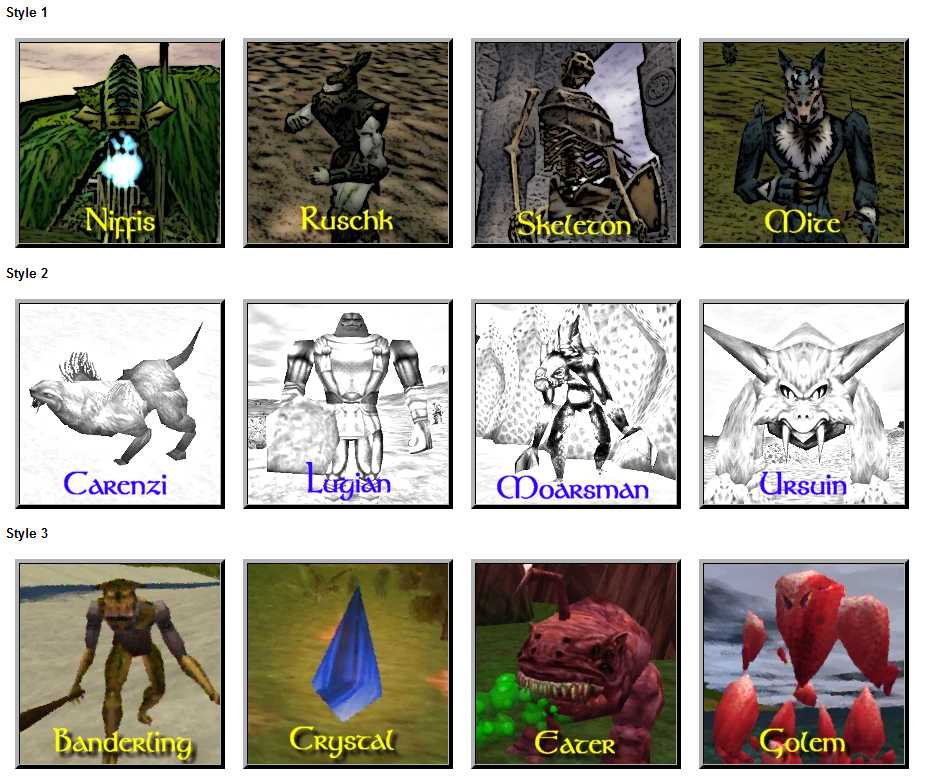
- I would say style 1 or 3. I like the full color and the gold type that mimics the splash screen style. I would like 1 better if the filter wasn't applied so heavily. Is that poster edges in photoshop? I would put edge thickness and intensity at 0, and posterization at 4-6. I think too much of the detail gets taken over by the black of the edges. In addition to adding an artwork section to the creature pages, I'd suggest adding all the creature art to the Artwork page. --An Adventurer 10:44, 9 December 2008 (CST)
- I also vote for style #1. It will be a great touch to those pages. --Atarax 15:46, 14 December 2008 (CST)
- Let me give my rationale for a less detailed image, since these are intended to be illustrative images the stylization was intended to move from a particular creature/place/item to a generalization as well as to provide some similarity across images by lessening lighting/resolution issues. In other words a consistent feel for illustrative images. The effect is done using the free open source program GIMP 2.6 using Filters>Artistic>Cartoon (Mask Radius 8.00; Percent Black 0.200) on 200x200 pixel image. Best to use a PRT SCR from in game, or save as bitmap if cropping with Wiki Swiss Tool because jpg artifacts sometimes get highlighted by the filter.
- I also vote for style #1. It will be a great touch to those pages. --Atarax 15:46, 14 December 2008 (CST)
- I should add that style 2 might work well for some things, I've temporarily used it for Moarsman so you can see how it fits into an actual page. Style 2 uses a downloadble filter Quick Sketch which is placed into the C:\Program Files\GIMP-2.0\share\gimp\2.0\scripts folder (or in the scripts folder in your User profile folder) and Script-Fu>Artistic>Quicksketch (Blur Factor 30). The contrast may need to be adjusted for a more pleasing image (Colors>Brightness-Contrast).--Tlosk 10:32, 18 December 2008 (CST)
Redesign October 2008
I propose to add a link to the navigation that goes to the Current Patch. -- Atarax
- took a little fiddling around with and searching mediawiki for info, but I've added a topics side bar --An Adventurer 13:40, 28 October 2008 (CDT)
- Very cool. That makes it very convenient to get around. The only other suggestion I have is to possibly put a link to the Page Templates in the toolbox or navigation section. It would make contributing easier, especially for newcomers. -- Atarax
- I'm not sure how to edit the toolbox. I created a help section on the main nav section. Please let me know if this makes the nav bar too long. --An Adventurer 14:59, 2 November 2008 (CST)
- I like the help section there. I think you should put the search at the top, followed by navigation, topics, help, toolbox (in that order). Other than that, its definitely not too long. --Atarax
I read your post you removed Tlosk. I was thinking about leaving the main topics section below the welcome, and keeping the larger links at the top. But most of those links at the top of the home page are either in the topics section, or now a link on the side bar. Maybe I will play around with it in the sandbox later --An Adventurer 16:22, 28 October 2008 (CDT)
I recolored the topics section, it's in the Sandbox. let me know what you think. --An Adventurer 15:18, 30 October 2008 (CDT)
- Cool, I think that looks nicer. (I shifted the few posts at the bottom back to a last is first format so easier to see new ones for the talk page). --Tlosk 17:39, 30 October 2008 (CDT)
- I think it looks a lot nicer too. The links are a little hard to read though (grey on black). Overall a nice improvement! --Atarax 30 October 2008 (CDT)
- I changed the color of the links to a lighter grey. I blocked the user that removed all the content from this page. Do we need to protect it? --An Adventurer 19:00, 30 October 2008 (CDT)
- I don't think so, if I had to guess I think it was probably accidental, being a new user. --Tlosk 20:39, 30 October 2008 (CDT)
- I find the white links in the big black box on large white page very hard to read. I think there's just too much contrast between the black background and the rest of the page. --Widgeon 01:19, 31 October 2008 (CDT)
- There are now 5 versions of the banner+topics in the Sandbox, please have a look --An Adventurer 10:35, 31 October 2008 (CDT)
- I find 1, 2, and 5 all appealing, no strong preference here. --Tlosk 14:58, 1 November 2008 (CDT)
- I think the first one is the easiest to look at. 2, 3 and 4 all have the black background in a white page that I find hard to read. 5 isn't too bad, but I'd still go with a lighter color with the border. Please keep in mind that this is more an issue of usability (hard to read) than taste (looks good or bad). --Widgeon 08:13, 2 November 2008 (CST)
Suggestion for turbine articles
For patch pages, I think it would be a cool idea to give the teaser, roll-out article, and release notes a background color or some other styleing make them seem more like they are from the Turbine website, i.e. official (kind of like we do with dev posts). Would kind of help separate them from the rest of the patch page. Any thoughts on this? --Atarax 28 October 2008 (CDT)
- I've added an Archive of Internet Article Template for the current site design. So, if others think its a good idea to start using the internet article templates for patch notes, we have the two most recent templates available. We could also just use the light grey dev post template, so all patch pages use the same style. --An Adventurer 12:47, 31 October 2008 (CDT)
Site Logos and Appearance
I still see the old "Set $wgLogo..." thing, any idea why that is? --Sanguis 21:42, 15 May 2008 (CDT)
- It's a cache issue, Sometimes it will clear if you just hit refresh also but more likely you'll need to clear your browser's cache and then you should see it. In Firefox go to Tools->Options->Privacy->Settings, make sure cache is checked, hit OK, then hit Clear Now. In IE I believe it's Tools->General->Delete Browsing History. Not sure on IE though (also menu bar may be hidden, if so I think there's a tools button). Let me know if you see it after that, if not there's something I might do to the site.--Tlosk 06:06, 16 May 2008 (CDT)
- It's all good now, I cleared my cache right after that and its been fine since. Looks good, good job. --Sanguis 00:30, 18 May 2008 (CDT)
I tried a few ideas that didn't pan out, I posted a screenshot of the first one and a new one in mockups if you'd like to see what you think, or make suggestions for a new one. Sandbox. --Tlosk 18:06, 4 March 2008 (CST)
- I like the one on the darker background a lot. It would be great if we could get the title to look as good....--Gouru 19:55, 4 March 2008 (CST)
- I just finished a banner in the same style and posted a new mockup in the Sandbox.--Tlosk 21:24, 4 March 2008 (CST)
- Looks great, both logo and banner. Also, sort of related I guess. I was looking through my fonts, and I believe that I found the font turbine uses in the splash screen for the name of the patch. Its Padula.--An Adventurer 08:52, 5 March 2008 (CST)
- Excellent, I hadn't been able to figure that out, turns out it was because I didn't happen to have that font installed on my machine. But I was able to pick it up and here's new versions using Padula, I think they look much nicer:
- I think those look great, nice work. --An Adventurer 21:55, 5 March 2008 (CST)
Also, I think we should consider replacing that image in the top left corner, the SET $wgLogo to the URL path, it looks ugly and it would not be hard to make a nice ACC one. Do we need Gouru to do that? If not then if someone knows how, I would be happy to make the logo for it. --Sanguis 14:44, 29 January 2008 (CST)
- I have no idea how to add a logo, I'm assuming its an admin only thing.
- I'll go ahead and make the changes to the new sections. Thanks.
- Also about the main page. Should we hide the table of contents? You can hide it by placing __NOTOC__ on the page. We could replace it with a more attractive TOC or just leave it out. Thoughts? --??
- After reading the comments about the Home image, I noticed that too, I made a quick image with what I believe are the proper dimensions and properly alpha'd background but I couldn't find a contact to send to, does anyone have contact info for Gouru? Here's the image if anyone has suggestions on improving it: --Tlosk 15:28, 22 February 2008 (CST)
- Media:ACCWikiHome.png
- Sorry, I've been busy with other projects.
- I'd rather hold off on posting that Logo. I like the concept and design, it's just the execution looks 'fuzzy' and incomplete to me. If it was sharpened with shiny steel look and feel it would be perfect.
- I'm going to look at adding some 'super-user' capabilities for An Adventurer and Tlosk (since I LOVE the work you guys are doing)
- This is meant to be a community board and it makes me VERY happy to see that it is still going well even without me peeking in every few days. --Gouru 16:57, 3 March 2008 (CST)
- Just noticed that my view when logged in is significantly different than when logged out. I'll try to figure out which should be the default, because my logged in view does not have a logo space. Probly have something configured wrong :( --Gouru 17:22, 3 March 2008 (CST)
- Good to hear from you Gouru. Thanks for the sysop status. Good to see you are still around ;) --An Adventurer 18:06, 3 March 2008 (CST)
I just found what I guess was a failed AC lore wiki. Although its not being updated, the style of the pages are really nice so I thought I'd put a link here: Halls of Knorr
It would be so great if we could find who did that wiki and have them fluf up this one to not look like crap. --An Adventurer 14:15, 8 February 2008 (CST)
- That's a website for a guild on Frostfell I believe, it was active only a few months ago. As for the general look, it's probably a custom skin, which is something we could look into but ultimately Gouru would need to install, you can check out how to make skins for this specific engine here [[1]] and here [[2]]. Also, there is a guide [[3]] that shows how to setup the logo and such. --Sanguis 10:17, 13 February 2008 (CST)
Older Discussions
I just redesigned the front page slightly. First, I have redone the topics table. None of the links from the old version were removed, but a few new ones were added, and I tried to sort them into general categories.
I also moved the announcements below the topic and getting started section, just to see what it looks like. I felt that the topic section might be more important to have at the top. Its really simple to reverse if anyone has a problem with it though.
That search plugin is very slick, nice work. --Tlosk 09:17, 22 August 2008 (CDT)
If anyone else wants to comment on the category overhaul (List of Categories), please do so - Talk:List_of_Categories. I'm going to start on it Sunday night (March 02) so things may be a little messy for a day. We're starting to get a lot of entries so better to get this done sooner rather than later. --Tlosk 09:31, 2 March 2008 (CST)
Gouru is hard to get ahold of. I've sent him a few PMs on the turbine boards but he only responded to the first one, which was about the spam on the message board here, which has still not been taken care of. I've sent both him and maddy requests for admin powers here since neither of them are active on the wiki, but haven't heard anything back yet. --An Adventurer 15:32, 22 February 2008 (CST)
Coming to it with fresh eyes I find the current layout easier to quickly read. One suggestion I might make though would be to bold the couple that people click on the most (for example, quests, current patch, and dungeons?) --Tlosk 13:27, 22 February 2008 (CST)
So a week ago Thargos changed the layout of the topics section from horizontal to vertical. I personally don't like the new look, but that may just have been because I was used to the old set up. So here are the two styles side by side. What does everyone else think? Keep it as is? Go back to old style? or try something new?
Current:
| Patch Information | Game Information | Databases | Items | Magic | Dereth | Crafting | Lore |
|---|---|---|---|---|---|---|---|
| Current Patch | General Information | Quests | Items | Spells | Locations | Alchemy | Lore - Main Page |
| Previous Patch | New Player Guide | Monsters | Weapons | Components | Towns | Cooking | Texts |
| All Patches | Returning Player Guide | NPCs | Armor | Casters | Dungeons | Fletching | Factions |
| AC History | Plugins | Titles | Jewelry | Special Spells | Settlements | Tinkering | Current Story Arc Summary |
Previous:
| Patch Information | • | Current Patch | • | Previous Patch | • | All Patches | • | AC History |
|---|---|---|---|---|---|---|---|---|
| Game Information | • | General Information | • | New Player Guide | • | Returning Player Guide | • | Plugins |
| Databases | • | Quests | • | Monsters | • | NPCs | • | Titles |
| Items | • | Items | • | Weapons | • | Armor | • | Jewelry |
| Magic | • | Spells | • | Components | • | Casters | • | Special Spells |
| Dereth | • | Locations | • | Towns | • | Dungeons | • | Settlements |
| Crafting | • | Alchemy | • | Cooking | • | Fletching | • | Tinkering |
| Lore | • | Lore - Main Page | • | Texts | • | Factions | • | Current Story Arc Summary |
--An Adventurer 20:45, 16 February 2008 (CST)
Bottom for sure, the top one is too disorganized it looks very nasty. --Sanguis 16:43, 31 January 2008 (CST)
There, I think I have the topics in a better style now. which do you like better?
| Patch Information | • | Current Patch | • | Previous Patch | • | All Patches | • | AC History |
|---|
| Game Information | • | General Information | • | New Player Guide | • | Returning Player Guide | • | Plugins |
|---|
| Databases | • | Quests | • | Monsters | • | NPCs | • | Titles |
|---|
| Items | • | Items | • | Weapons | • | Armor | • | Jewelry |
|---|
| Magic | • | Spells | • | Components | • | Casters | • | Special Spells |
|---|
| Dereth | • | Locations | • | Towns | • | Dungeons | • | Settlements |
|---|
| Crafting | • | Alchemy | • | Cooking | • | Fletching | • | Tinkering |
|---|
| Lore | • | Lore - Main Page | • | Texts | • | Factions | • | Current Story Arc Summary |
|---|
| Patch Information | • | Current Patch | • | Previous Patch | • | All Patches | • | AC History |
|---|---|---|---|---|---|---|---|---|
| Game Information | • | General Information | • | New Player Guide | • | Returning Player Guide | • | Plugins |
| Databases | • | Quests | • | Monsters | • | NPCs | • | Titles |
| Items | • | Items | • | Weapons | • | Armor | • | Jewelry |
| Magic | • | Spells | • | Components | • | Casters | • | Special Spells |
| Dereth | • | Locations | • | Towns | • | Dungeons | • | Settlements |
| Crafting | • | Alchemy | • | Cooking | • | Fletching | • | Tinkering |
| Lore | • | Lore - Main Page | • | Texts | • | Factions | • | Current Story Arc Summary |
--An Adventurer 20:56, 30 January 2008 (CST)
Ok I replaced the TOC, I left out the links to welcome and getting started since they are right at the top of the page anyway. I also removed the large link to the patch page and replaced it with a smaller link in the new TOC
Also, I changed the Topics section a bit. I didn't like the look of the generic table, so I made the table lines invisible. But when I saw it with no lines at all, it looked a little wierd. It needed the lines to break up the categories, so thats why I put those in. --An Adventurer 20:07, 30 January 2008 (CST)
I like the idea of replacing it, but until then it should be left there for people who might want to skip around.
--Sanguis 17:02, 30 January 2008 (CST)
I think current events should be strictly game only, i.e: live events, patch all kinds of things like that and announcements be wiki-only, archiving would be good for current events, not sure if its really necessary for the wiki but I guess thats up to others to decide as well. Archiving in the AC history page seems to be the best place for archive current events, I agree on that initiative.
Also, I think we should consider replacing that image in the top left corner, the SET $wgLogo to the URL path, it looks ugly and it would not be hard to make a nice ACC one. Do we need Gouru to do that? If not then if someone knows how, I would be happy to make the logo for it.
--Sanguis 14:44, 29 January 2008 (CST)
--An Adventurer 12:16, 13 December 2007 (CST)
I've been sticking news in the announcements section, things posted by the devs and such. I just checked out the current events section, and it had 1 old news story so I stuck all the things from announcements there. Questions:
1. Should we add news to both the announcements and current events? Or should Current events be only for game news, announcements for wiki news, or vice versa?
2. Should we create an archived news section? If so, I think it would be a good addition to the AC history page, which is currently lacking in information. If created we could place tons of old stuff in there like weekly updates and such from before the wiki was created.
--An Adventurer 14:43, 7 December 2007 (CST)
I just created a jewelry page, so I replaced the "spells" link under items with jewelry. For now, I've created a link to the spells in the general info page under magic.
--Sanguis 21:57, 3 December 2007 (CST)
Well done, it looks much better with this structure, I think it's much more accessible now, we should focus on filling those current sections as much as possible once the patch content is filled out.
--An Adventurer 23:11, 1 December 2007 (CST)
I NEED HELP
this is driving me nuts. I hotel hop and cant get on AC. i have no clue what to do or who to call. ive been looking and looking for a number. SOMETHING> I looked under the support parts of ac main page and dont understand how to do what there tellin me.
BTW my problem is that when i get into the game it automatically looses connection. not the firewall ect turned all that off. I tried to get on today and IT LET ME> then i logged off and tried to log back on and it started doing the same thing. when i ACTUALLY got through i didn't do anything different. someone please ive been trying for days
NOTICE
I am a returning player to ac that happened upon this wikia by searching asherons call wiki. the wikia wiki was the first one to pop up in Google and as such i started to use this wiki. I was quite surprised to see how much content that this wiki contained and was rather thrilled as many wiki's are lacking info for many of the games that I play. However after using this wiki for a few days and posting, I found that this wiki has mostly moved and that the new wiki has over a thousand more pages. After finding this information I will also be making my post to the new wiki. I don’t really mind this but there should really be a notice that the wiki has moved on the main page as it is very painful to maintain two wiki's at the same time. I have personally tried to do this once in the past It not only burnt me out of trying to administer those 2 wiki's but unless I feel it is important I rarely even find that I have a desire to post at all unless it is a matter that i find of some import. From my understanding it was a nearly unanimous decision of the admins and the most frequent posters to this wiki that the wiki be moved. This to me says that for the most part (with the exception of the newcomers like me) the information on this site is going to become out dated at best and/or riddled with profanity and other junk/blanked. This will also take the legitimate good solid content that those newcomers could and likely would have posted on the new site and and render it lost in the decrepit state that this old site will likely become after some time. I would have put such a notice up myself how ever since there is not one up yet I'm thinking that there may be some reason for this. Such as not all information has been carried over, possible repercussions from wikia(like bans on admins etc.) or perhaps in an effort of holding on to this wiki as a backup just in case the new server just does not work out.
As with all future edits to the ac community I will be posting this to the other wiki as well until the old one has some sort of notice that it has been discontinued on the main page.
Namid 12:01, February 10, 2011 (UTC)
- Believe me, if we could put up a notice or have this wiki deleted entirely, we would have. Unfortunately wikia has a policy of not removing wikis after a move, and also forbid notices like the one you are requesting. This is because Wikia is a for-profit company, and will do whatever it takes to get people to traffic their site rather than an alternative. They do not care about the Asheron's Call community, they care only about how many times their ads are viewed.
I do try my best to keep up with the recent changes on this wiki, and remove any vandalism that I see. I've also sometimes let new contributors know about the move on their talk page. That is really the best we can do. --An Adventurer 17:17, February 10, 2011 (UTC)